Tableau Tricks with ClickHouse®

With the announcement of the Altinity Tableau Connector for ClickHouse, we wanted to take the opportunity to show off some handy Tableau tips and tricks for making some very cool charts based off of ClickHouse data.
We know that setting up your own ClickHouse test server with sample data can take a little time and storage, so we’re saving you all of that by providing a free demo ClickHouse cluster hosted on Altinity.Cloud. This demo ClickHouse database has gigabytes of test data, such as airline flight information, HTTP log files, and more.
For these examples, we will be using the table tripdata, which is a collection of taxi rides in New York City. These charts combine the speed and ability of ClickHouse to search through gigabytes of information, then display that in colorful and beautiful Tableau charts.
Set Up Data Source
Before we get to creating charts, we have to set up a Data Source connection to our Altinity.Cloud ClickHouse database. This step is what all of the other steps rely on.
If you haven’t had a chance to install the new Altinity Tableau Connector for ClickHouse, start by following the instructions on our Altinity Docs Site with the article Connect Tableau Desktop to ClickHouse. As of this writing, the Tableau connector is available as a public beta, with the official connector to be released soon.
Once the Tableau connector is installed, we can create our Data Source to our demonstration Altinity.Cloud database through the following steps:
- Launch Tableau Desktop.
- From the Connect menu, select To a Server -> More.
- Select ClickHouse by Altinity Inc.
- Enter the following:
- Server:
github.demo.trial.altinity.cloud - Port:
8443 - Database:
default - Username:
demo - Password:
demo - Require SSL:
Enabled
- Server:
- Select Sign In to complete the connection.
Custom SQL Entry
To make our ClickHouse queries more efficient, we’re going to add in a Custom SQL Query into our Tableau Data Source.
From the Data Source screen:
- From the left navigation panel, select New Custom SQL.
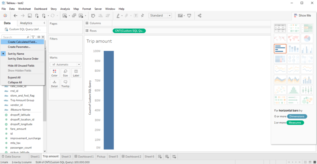
- Enter the following SQL query:
select toString(rand64()) as rnd_id, *
from tripdata
limit 100000000 - Click OK.
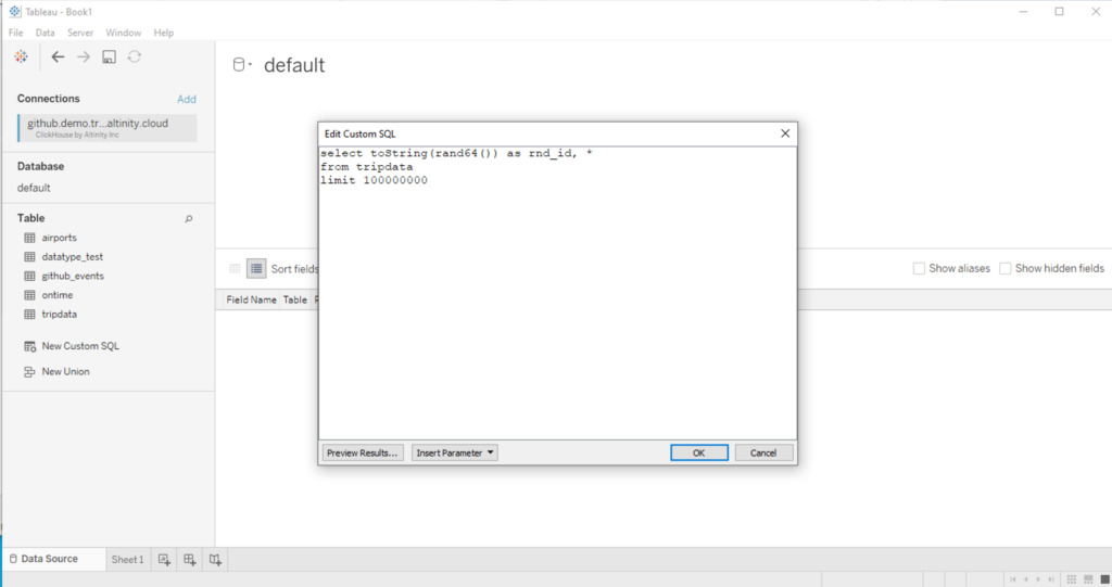
This SQL query selects a random 100,000,000 records from the tripdata table, making a reasonable sample set without querying every single record from the table.
Dropoff Heat Map
This heat map of New York displays the most popular drop off locations from taxi rides. This will display the least common taxi drop offs in cooler colors (green and blue), while the most popular drop offs are in hotter colors (orange and red).
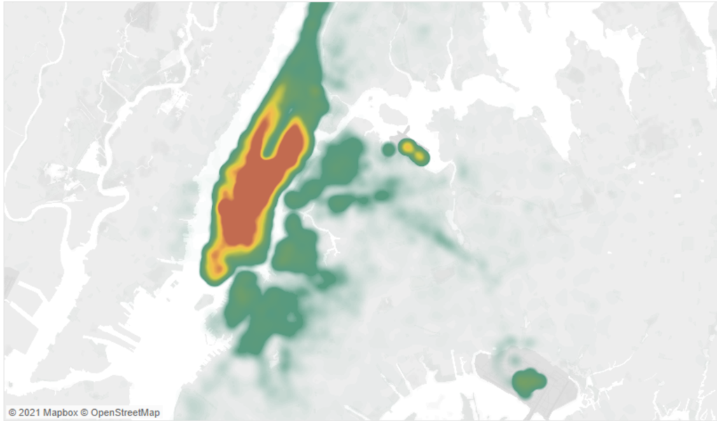
Start by creating a new sheet in your Tableau workbook and follow these steps:
- Drag and drop the following fields into the respective location. The visualization symbol maps will be automatically selected once these fields are in place:
dropoff_longitude: Add this to the Columns field.dropoff_latitude: Add to the Rows field.
- Drag and drop the field rnd_id created in the step Custom SQL Entry above into the Marks section.
- In the Marks section, set the dropdown from Automatic to Density.
- Select Color, and set:
- Color to Temperature Diverging.
- Intensity to 90%.
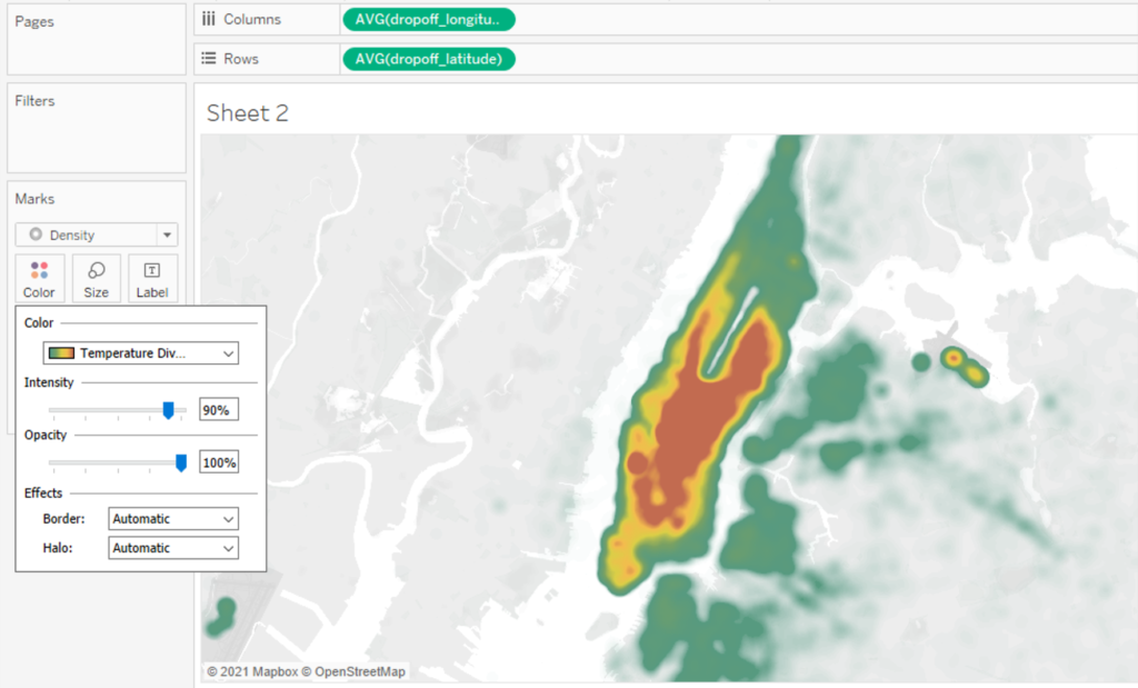
- Use the select zoom feature to zoom the map onto New York City – the majority of the heatmap highlights will be there.
As an experiment, change the Columns and Rows from dropoff_longtitude and dropoff_latitude to pickup_longitude and pickup_latitude to change the heat map from displaying the most popular dropoff positions to the most popular pickup positions.
Total Amount Group Chart
This handy chart takes a look at groupings of what people pay in the New York area for their taxi rides. Easy? Super easy.
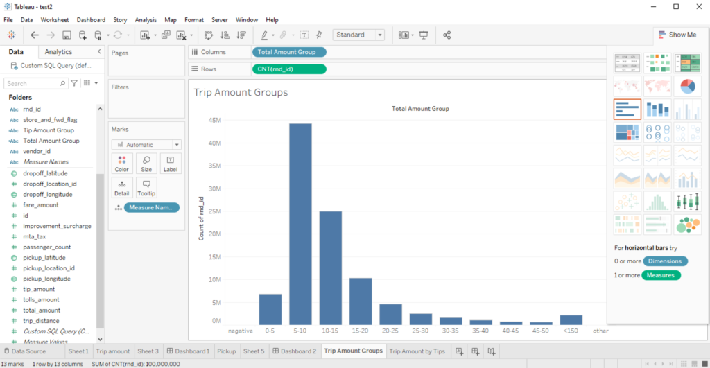
Here’s how you do it.
- Connect to the ClickHouse Altinity.Cloud demo from the Setup Data Source step. This is also where we set up the custom field rand_id.
- We’re going to create a new Calculated Field by selecting the dropdown caret and selecting Create Calculated Field. Name it Total Amount Group and enter the following:
IF [total_amount] < 0 THEN "No Fee"
ELSEIF [total_amount] >= 0  AND [total_amount] <= 5  THEN  "0-5"
ELSEIF [total_amount] > 5  AND [total_amount] <= 10  THEN  "5-10"
ELSEIF [total_amount] > 10  AND [total_amount] <= 15  THEN  "10-15"
ELSEIF [total_amount] > 15  AND [total_amount] <= 20  THEN  "15-20"
ELSEIF [total_amount] > 20  AND [total_amount] <= 25  THEN  "20-25"
ELSEIF [total_amount] > 25  AND [total_amount] <= 30  THEN  "25-30"
ELSEIF [total_amount] > 30  AND [total_amount] <= 35  THEN  "30-35"
ELSEIF [total_amount] > 35  AND [total_amount] <= 40  THEN  "35-40"
ELSEIF [total_amount] > 40  AND [total_amount] <= 45  THEN  "40-45"
ELSEIF [total_amount] > 45  AND [total_amount] <= 50  THEN  "45-50"
ELSEIF [total_amount] > 50  AND [total_amount] <= 150  THEN  "<150"
ELSE "Other"
END- Place the rand_id field into the Rows field, then select it and set it to Measure -> Count. Drag the new Total Amount Group into the Columns field.
- Select the Horizontal Bars visualization to see the charts displayed.
Tip and Total Amount Grouping
If you’re in the US, you might be used to the idea of tipping – giving someone a little extra as a job well done. So how do people who ride about New York tip as opposed to what they pay?
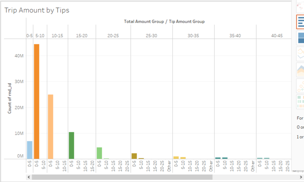
Turns out we can find out with the visualization Horizontal Bars, providing a way to group the amount paid on a trip with how much the taxi driver received in tips.
We’ll start with a new sheet, and proceed much as we did with the stage Total Amount Group Chart. Make sure you’re connected to the Altinity.Cloud demo site first, then follow these steps:
- Create a new Calculated Field by selecting the dropdown caret and selecting Create Calculated Field. Name it Tips Amount Group and enter the following:
IF [tip_amount] < 0 THEN "No Tip"
ELSEIF [tip_amount] >= 0  AND [tip_amount] <= 5  THEN  "0-5"
ELSEIF [tip_amount] > 5  AND [tip_amount] <= 10  THEN  "5-10"
ELSEIF [tip_amount] > 10  AND [tip_amount] <= 15  THEN  "10-15"
ELSEIF [tip_amount] > 15  AND [tip_amount] <= 20  THEN  "15-20"
ELSEIF [tip_amount] > 20  AND [tip_amount] <= 25  THEN  "20-25"
ELSE "Other"
END
- Place the rand_id field into the Rows field, then select it and set it to Measure -> Count. Drag the Total Amount Group into the Columns field, then the new Tips Amount Group directly behind it.
- Select the Horizontal Bars visualization to see the charts displayed.
From the data, we can see the most common tip – even for more expensive rides – is reported at just $5. Folks – tip your drivers.
The City That Never Sleeps
You’ve heard the phrase “New York – the City That Never Sleeps!” But – can we prove or disprove it?
(Yes. The answer is yes.)
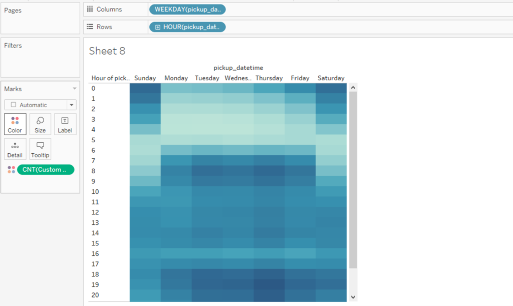
We can use Tableau once again to ask the question – does the city sleep, and when? Let’s create a Lines(Discrete) chart to take a look.
Load up Tableau, and with your ClickHouse Demo connection create a new sheet and populate the following:
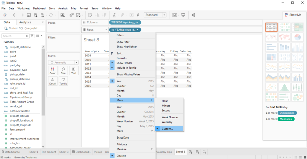
- Drag the field pickup_datetime into the Columns field.Select the caret, then scroll down to More -> Weekday. This way we’ll filter out the weekends, when people are more likely to be out late.
- Select the field pickup_datetime and put it into the Rows field.Select the caret, then scroll down to More -> Other, then select Hours as the measure.
- Drag and drop Custom SQL Query (this was made in the step Custom SQL Query) onto Marks -> Colors.
- At this point, the visualization Lines (Discrete) will be selected. To make it easier to understand, select Colors -> Edit Colors, then set the Palette to Red-Green Diverging. This will show higher numbers in green, and lower numbers in red.
What does this show us? Just that if you want to find the time when New York City sleeps, your best bet will be Tuesday or Wednesday at about 4 AM.
Pickup from Times Square
For a city like New York, thousands of people make their way into what may be one of the most recognized centers of the world: Times Square. What we can use our ClickHouse database to discover is: where do people go when they leave Times Square?
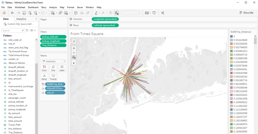
We’re going to show how to build a radial map, and filter pickups in the general area of Times Square. If you look at the geographic coordinates, Times Square is located at 40.75889587 latitude, -73.98513794 longitude. Since odds are our taxi cab drivers aren’t logging that exact geolocation when they pick up riders, let’s try to make this:
- A map centered on New York City that shows:
- Taxi pickups from around Times Square – so between latitude 40.757 and 40.759, and longitude -73.986 and -73.985.
- Just to isolate people who are traveling around New York City, we’ll add in a filter to only take in rides that are less than 100 miles.
With that, let’s start up another sheet with our Altinity.Cloud demo database connection and make some maps.
- From our new sheet, create a Calculated Field by selecting the caret in the Data section.
- We’re going to make 2 Calculated Fields with the following settings. These are going to put geographic markers for where a taxi passenger was picked up, where they were dropped off, a line between those two points, and a length. Note that while the length is listed in miles, its really more of a general representation of distance with the data we have.
- Name:
Travel_Path
Calculation:MAKELINE(makepoint([pickup_latitude],[pickup_longitude]),makepoint([dropoff_latitude],[dropoff_longitude])) - Name:
Trip_Distance - Calculation:
Distance(MAKEPOINT([pickup_latitude],[pickup_longitude]),MAKEPOINT([dropoff_latitude],[dropoff_longitude]),"miles")
- Name:
- With that all set up, all we have to do is add our fields into the following areas. Drop the Travel_Path Calculated Field into the Marks section. This will cause a lot of lines to appear – that’s fine. Tableau will automatically add the latitude and longitude fields where they need to be in the Columns and Rows section.
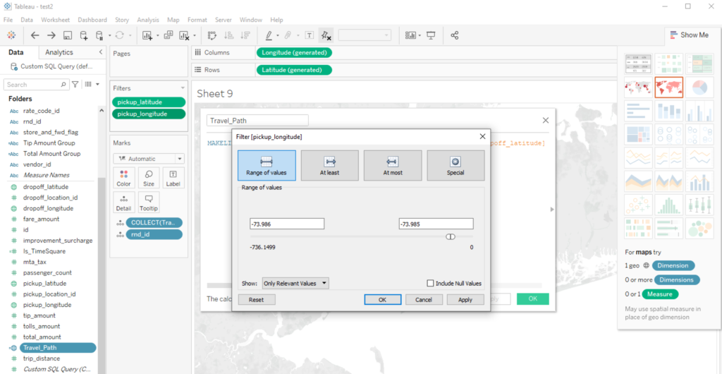
- Add pickup_latitude and pickup_longitude into the Filters section, and add the following filter to each:
- pickup_latitude: Set the filter values to a range of 40.757 and 40.759.
- pickup_longitude: Set the filter values to a range of -73.986 and -73.985.
- Add our friend rnd_id into the Marks section.
- Add Trip_Distance into the Filters section and set the ranges from 0 to 100. This is a straight line and doesn’t take into account actual city driving, but gives you some idea of how far someone travels.
- Add Trip_Distance to Marks -> Color, then set Trip_Distance to Discrete. This will show each transport as a separate color.
And there you have it! You can see where people have gone from Times Square as they travel about New York City. You can select a line and see more details about it.
Try It Yourself
If you’ve enjoyed this look at how to use a ClickHouse database to fuel your Tableau charts and dashboards, then try it out! The instructions for installing the beta Altinity Tableau Connector for ClickHouse are available on the Altinity Docs site. And of course, try out ClickHouse through the Altinity.Cloud demo site as detailed above.
If you have issues, let us know! We want to help make ClickHouse even more popular, and if we can improve the experience on either Altinity.Cloud or the beta Altinity Tableau Connector, that’d be even better. If you have any problems or have a recommendation, please let us know through either the Altinity Contact page, or info@altinity.com.
ClickHouse® is a registered trademark of ClickHouse, Inc.; Altinity is not affiliated with or associated with ClickHouse, Inc.