Visualizing ClickHouse® Data with Apache Superset, Part 2: Dashboards

Our previous blog article on Apache Superset showed how to set up Superset and connect to ClickHouse. In this follow-on we get to the fun part: visualizing data using dashboards with a few of the plethora of charts that Superset provides.
Dashboards as it turns out are easy to create. Most of the work happens around lining up data and building charts. Our introduction touches on only a few of the many capabilities of Superset, but it should enable you to discover many more on your own.
Let’s get started.
Superset and ClickHouse configurations
It should be possible to replicate examples in this article using any configuration of Superset and ClickHouse that pleases you. Just ensure the software versions are current and you have the clickhouse-sqlalchemy driver correctly installed. Minimum recommended versions are Superset 1.1.0 and clickhouse-sqlalchemy 0.1.6. I used ClickHouse 21.1, but earlier and later versions should also work. In my case I’m also using SaaS instances of both products from Preset Cloud and Altinity.Cloud. Here’s a picture:
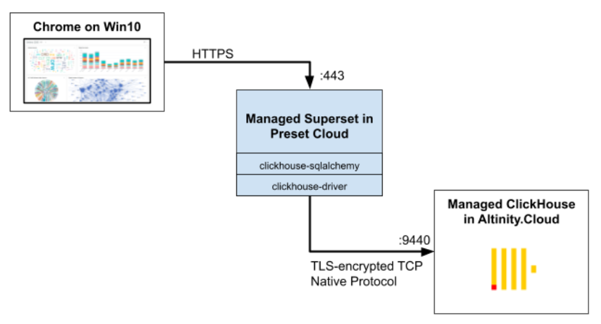
Note that the behavior of Superset and ClickHouse in the above cloud services is identical to the open source build from their respective community sites.
Superset dashboard overview
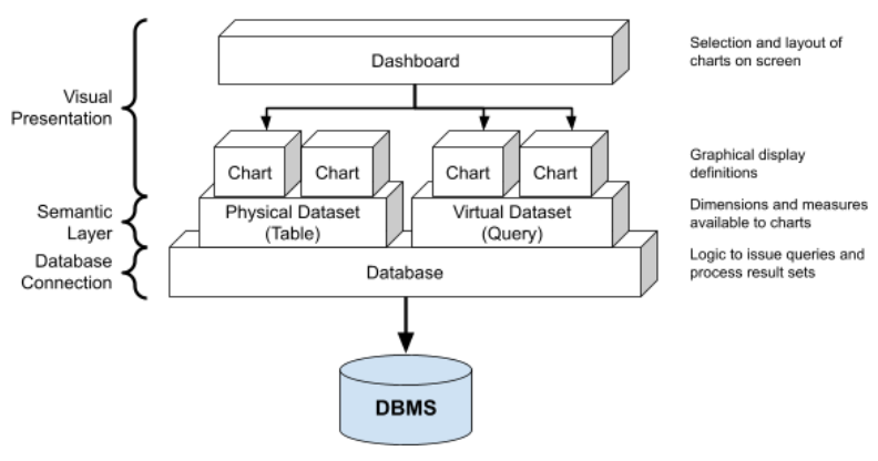
Superset has a layered architecture that divides the responsibilities for visualization into reusable components. A key feature is the “semantic layer” that provides an abstraction layer between dashboards containing charts and the underlying database itself. Here’s a picture to show how the plumbing works.
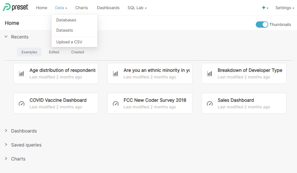
When you login to Superset, the home page has tabs and submenus to enable quick editing of components. Here is a typical example.
We will now walk through the process of creating charts from physical and virtual datasets, then link them into a dashboard.
Connecting to the Database
But first, we need to connect to ClickHouse. We showed how to do this in the previous blog article. In case you don’t have it handy, here is a quick refresher.
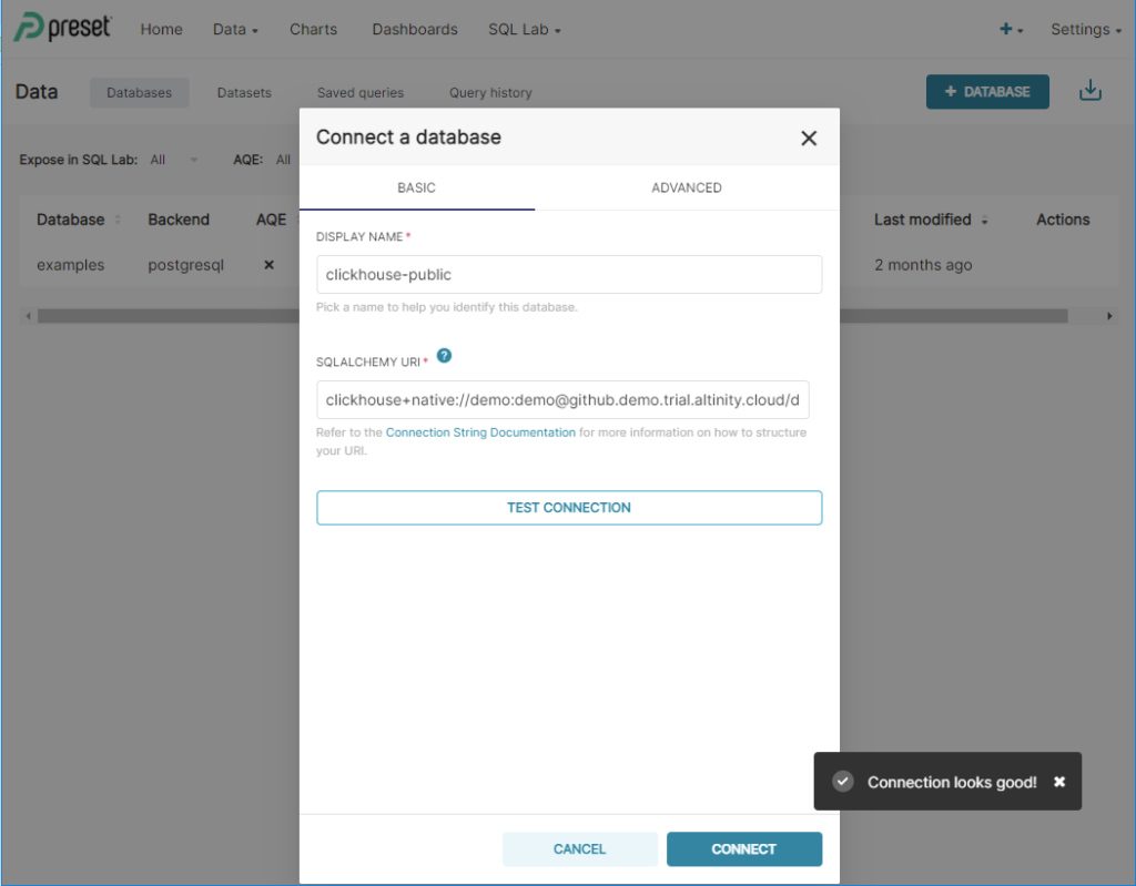
On the Home screen, press the Data tab and select the Databases submenu. A list of existing databases (if any) will pop up. Press the + DATABASE button and add ClickHouse connection settings. For this exercise we’ll use the following values. The URL points to a public endpoint hosted in Altinity.Cloud. It should be accessible from any host with Internet access.
DATABASE NAME: clickhouse-public
SQLALCHEMY URL: clickhouse+native://demo:demo@github.demo.trial.altinity.cloud/default?secure=true
Fill in the values, and press the TEST CONNECTION button. You should see the following:
Press the CONNECT button to save the connection. You are now ready to create datasets and builld charts.
Building charts on a single table
It’s often possible to create displays directly on individual fact tables, especially those that are denormalized to include lots of interesting columns. Superset physical datasets are perfect for this: they map directly to a single ClickHouse table. In this section we’ll show how to create the dataset and build a chart that uses it.
First, let’s create the dataset. Press the Data tab again, and select the Datasets submenu. A list of datasets will pop up. Press the + DATASET button. A dialog will pop up with drop-downs for dataset information. Select clickhouse-public as the connection, then choose schema default and table ontime. The dialog should now look like this.
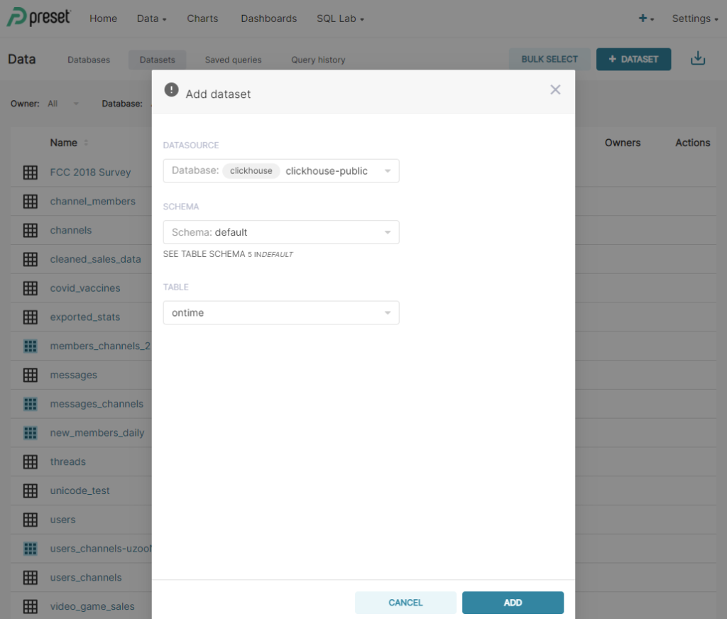
Press ADD to save the dataset. The new dataset will appear at the top of the list.
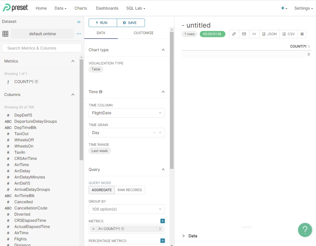
Once you have a dataset, it’s trivial to create your first chart. Just click on the dataset name on the Dataset page. Superset will switch to a screen to define a chart, which looks like the following.
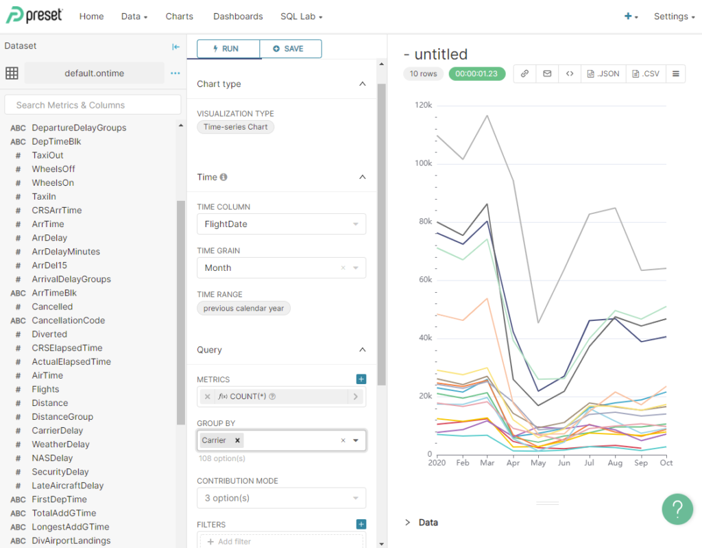
Let’s create a time series chart that shows airline traffic by carrier and by month for 2020. Fill out the page as follows.
- VISUALIZATION TYPE — Press the Table icon and select ‘Time-series Chart’ from the list of types.
- Time — Select the time range to show. Here are good values.
- TIME COLUMN — Select FlightDate if it is not already chosen.
- TIME GRAIN — Select Month.
- TIME RANGE — Use the wizard that pops up to select the previous calendar year.
- METRICS — Select COUNT(*), which should already be the default.
- GROUP BY — Select Carrier.
Once you have the values set, press the “RUN QUERY” button to see what the chart will look like. You should see something like the following.
Feel free to play around to get graphics you like using the CUSTOMIZE tab at the top of the panel. Personally I think stacked bar charts look nice for this type of display. When you are done, save the chart by pressing SAVE. Give it a nice name like Flights by Carrier 2020. Here’s an example of the save dialog.
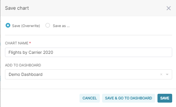
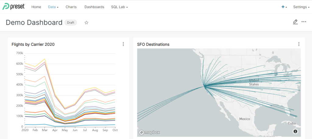
You can even put new charts straight into a dashboard by typing a name in the ADD TO DASHBOARD field. I typed in the name Demo Dashboard before saving the chart. This automatically creates a new dashboard and adds the chart to it.
Attentive readers will notice that we created this chart without writing or even seeing a line of SQL. Superset does the right thing, but as trained database devs we would really prefer to see the SQL for ourselves. Fortunately it’s easy to get the SQL text. Just press the three-lined property button next to .CSV on the upper right side of the panel. There’s a “View query” submenu item. If you press it you will see the generated query.
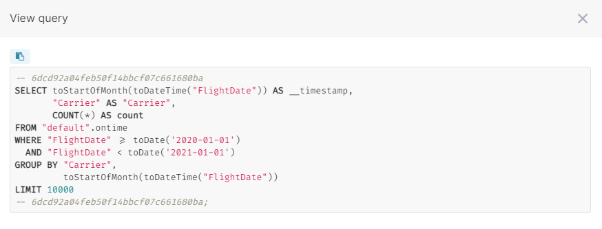
This is a nicely formed query and quite satisfactory. It shows the convenience of Superset datasets. They completely encapsulate the underlying table, including logic to generate SQL to access data. Once the dataset is available, you can visualize its data without recourse to SQL. This greatly expands the audience of users who can create imaginative data visualizations.
Building charts on complex queries
At some point it is necessary to write SQL if you want to join information from multiple tables or arrange data in interesting ways. Virtual datasets are perfect for this purpose–they work off a query instead of a table.
For this example we will reach back to our ontime dataset and provide daily aggregates for number of flights, number delayed, and number cancelled. Plus, we’ll add location information for the origin and destination airports, specifically latitude and longitude. Here is the query:
SELECT FlightDate, Origin, Dest,
  oa.Latitude as Origin_Latitude, oa.Longitude AS Origin_Longitude,
  od.Latitude as Dest_Latitude, od.Longitude AS Dest_Longitude,
  Flights, Cancelled, DepDelayed, ArrDelayed
FROM (
  SELECT FlightDate, Origin, Dest, count() Flights,
    sum(Cancelled) Cancelled,
    sum(DepDel15) DepDelayed,
    sum(ArrDel15) ArrDelayed
  FROM ontime
  GROUP BY FlightDate, Origin, Dest ORDER BY FlightDate, Origin, Dest
) AS o
INNER JOIN airports AS oa ON toString(o.Origin) = oa.IATA
INNER JOIN airports AS od ON toString(o.Dest) = od.IATA
Our example query illustrates a trick that Superset–or any other code generator–would not know how to do automatically, namely moving the join outside the base aggregation query. This is a standard optimization to improve performance by reducing the amount of data to drag along during the full table scan. It’s a good example how virtual datasets can also help with display latency.
The first step to turn our query into a dataset is to verify it in the Superset query editor. Press the SQL Lab tab and select the SQL Editor submenu. Superset will show a query window panel.
To test the query, perform the following steps.
- On the upper left side of the panel, select clickhouse-public as the database.
- Select default as the schema.
- Paste the query into the editor query window.
- Press RUN to try the query out.
Here is the result you can expect.
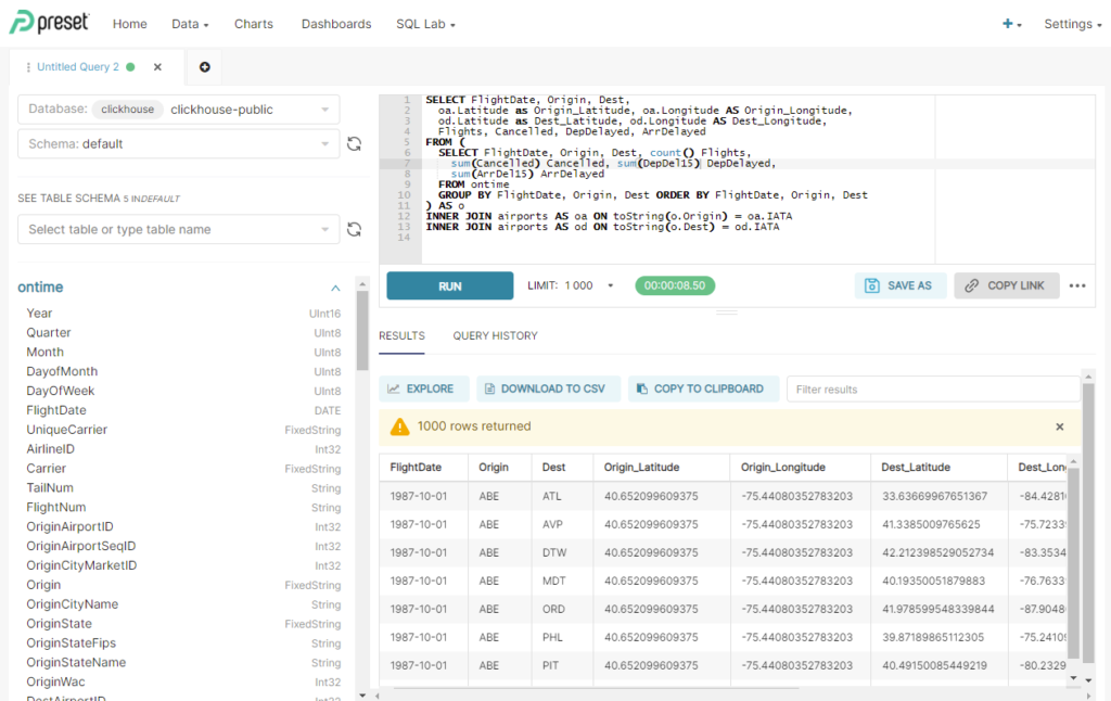
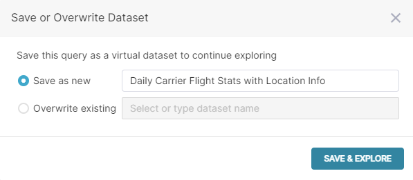
The SQL Editor restricts the number of rows returned, so the output is just a sample. If you are happy with the result, press the EXPLORE button, which will pop up a dialog to save the query as a virtual dataset. Fill in a meaningful name and press SAVE & EXPLORE, as shown in the following example.
Superset will automatically pop you into a chart panel, so that you can begin building a chart on the new dataset. The default panel uses a Table display, which is not very interesting. Instead, let’s create a graph that shows destinations from San Francisco. Fill in the panel information as follows.
- VISUALIZATION TYPE — Press the Table icon and select ‘deck.gl Arc’ from the list of types.
- Time — Select the time range to show. Here are good values.
- TIME COLUMN — Select FlightDate if it is not already chosen.
- TIME RANGE — Use the wizard that pops up to select the previous calendar year.
- QUERY — Select the location data.
- START LONGITUDE & LATITUDE — Select Origin_Longitude and Origin_Latitude.
- END LONGITUDE & LATITUDE — Select Dest_Longitude and Dest_Latitude.
- FILTERS — Use the popup to select Origin = ‘SFO’.
IMPORTANT NOTE: To use deck.gl Arc and other map displays you will need to have a MapBox API key. Preset.Cloud configures this automatically, but for home installs you’ll need to obtain it yourself. See the Superset documentation for instructions. It’s free. 😉
Press RUN QUERY to see the result. You should see something like this–an arc graph showing flight paths from SFO to all destinations last year.

Once you are pleased with the chart, you can save it for future use. Press the SAVE button and give the chart a memorable name like SFO Destinations. As before, you have the option to add the new chart directly to a dashboard.
Once again it’s interesting to see the SQL our new chart uses to select data from a virtual dataset. Let’s indulge our curiosity! Just press the three-lined property button on the upper right side of the panel and select View query. Superset shows the generated SQL code for us. The virtual dataset SQL is in a subquery.
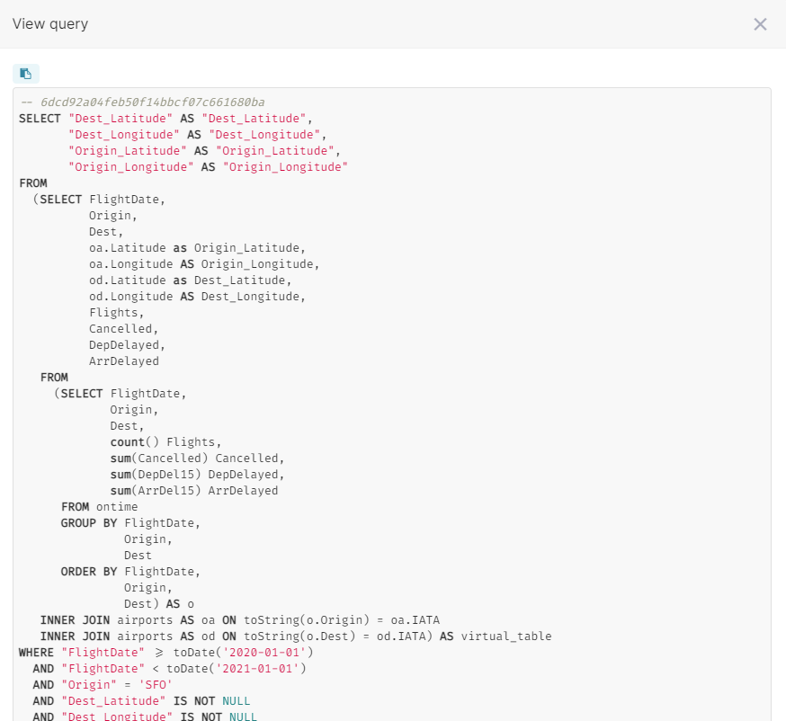
If you have used ClickHouse previously, you are most likely familiar with subqueries. This approach is pretty much what you would expect. ClickHouse is smart enough to push filter conditions down into the subquery, so the performance is quite good.
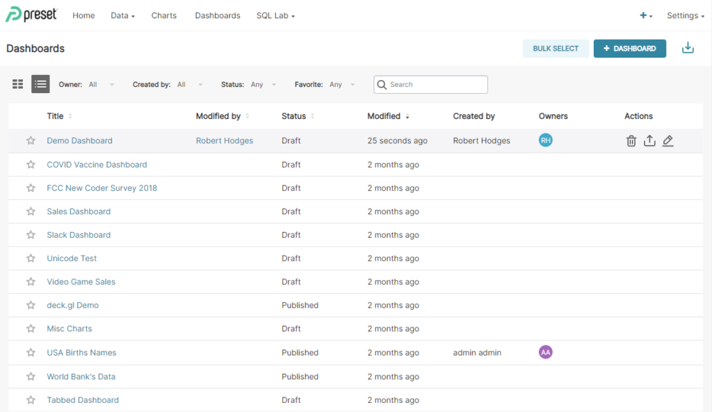
Publishing Charts on Dashboards
To view charts you need to assemble them into a dashboard. Select the Dashboards tab to see a list of existing dashboards. You can make new ones with the + DASHBOARD button. Here is the view when you enter.
Since we added the new charts to Demo Dashboard when saving them, that dashboard already has our charts. Just press the Demo Dashboard link in the dashboard list and you’ll see a dashboard like the following.
You can edit the dashboard by pressing the pencil icon on the upper right. The dashboard editor allows you to reposition or resize charts, create new rows and headers, and add more charts if you have them. Once you are satisfied with your dashboard, press the Draft button at the top. This will publish your dashboard so that it is visible to other users.
Taking flight with visualization
This blog article barely dipped into the many ways Superset can display ClickHouse data. For more information on Superset including additional chart types (there are dozens), dataset configuration, and specialized features like clustering and caching, check out the Apache Superset documentation as well as the extended docs available at Preset.io. For configuration specific to ClickHouse, check out Altinity documentation.
You can also ask questions about Superset and ClickHouse on either of the following Slack workspaces:
Finally, Altinity offers managed ClickHouse clusters via Altinity.Cloud. Preset similarly offers managed Superset in Preset Cloud. As noted at the beginning, I used both services for the examples in this blog article. Altinity and Preset have been working together to improve support for ClickHouse as well as provide secure communication options between our services.
For more information, don’t hesitate to contact us at info@altinity.com. Meanwhile, enjoy using Superset and ClickHouse together to visualize your data. If you do something interesting, let us all know. We hope to see you out in the community Slack channels!
ClickHouse® is a registered trademark of ClickHouse, Inc.; Altinity is not affiliated with or associated with ClickHouse, Inc.